Average wind direction?

John O

Senior Member
Hi Folks,

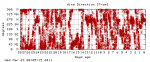
The weather station that many of you helped me with one way or another is up and running but the wind direction is erratic, to say the least.

I thought about taking the average of a few reading but have hit a problem:

If I take two readings which are (say) 200 and 210, the average gives a "good" value of 205. But if the two readings pass through North (say 355 and 05), the average is a nonsense value.

Can anyone suggest a way round that? It doesn't have to be Picaxe maths because it's the graphs of the wind direction on the PC that mainly need averaging - and the PC program has the full range of sines, cosines etc.

Thanks,

John.
 

MartinM57

Moderator
Gut reaction...add 360 to all readings, do the averaging, if the result is >=360 subtract 360.

...but it's only gut reaction, not proven or tested ;)
 

hippy

Technical Support
Staff member
When you get a wrapround like this, the best way is to move one reading up and past the wrapround, so to average ( slightly different values to your example ) 355 and 15, you convert to 355 and 360+15, average, then perform a modulo 360 ...

( 355 + 375 ) / 2 = 365

365 % 360 = 5

The challenge is in determining when one reading to another passes through the wrapround point.

For averaging wind direction, looking at what the direction was and for how long may have some merit. That would be averaging a set of samples and dividing by the number of samples.
 

premelec

Senior Member
New weather data suggestion...

I think often what is needed in a wind situation is not just average direction but direction combined with velocity and if you are looking at energy of the wind cube of the velocity.

Given we've got computing power and logging power I'm suggesting a 'new' measure - particle travel distance and direction over some time interval - in short if I released a piece of thistle down at time 1 where would it be at time 2 ? - an angle and distance vector.

I built some anemometer equipment years ago for some people studying wildfire travel and their data was coming in too fragmented with regard to direction - so we integrated it some.

In my current location what I want to know is where is the garbage can lid after a wind storm - likely angle and distance... :)
 
Last edited:

womai

Senior Member
This is actually quite a tricky problem in general. I remember reading a multi-page treatise on this a few years ago but can't remember where. You should try googling "calculate average wind direction" or similar.

Just as an illustration for how tricky it is, say the wind blows north for 1 hr and then south for 1 hr. What's the average direction? It's completely undefined.

As far as I remember the treatise said that average direction works reasonably well over shorter time spans (a few minutes or so) during which the direction doesn't vary a whole lot. Very difficult to do for long time spans.
 

John O

Senior Member
Thanks, all, for the suggestions.

It is such a random flapping about that it's doubtful that trying to determine if it passed through 0 or 180 has much meaning. Two consecutive readings of 270 and 90 could average at 0 or 180.

As you say, windspeed does play a part because, with no windspeed, the direction has no meaning and that's when the vane flaps around randomly the most. I was thinking about changing te length of the pointer on the wind direction gauge to be proportional to the speed but there's nothing equivalent I could do for the linear graph. It's made worse because the graph's vertical scale has to have 0 at the bottom and 360 at the top.

The bearing will probably rust up a bit fairly quickly so that may tame it! :)


John.
 

John O

Senior Member
This is actually quite a tricky problem in general. I remember reading a multi-page treatise on this a few years ago but can't remember where. You should try googling "calculate average wind direction" or similar.

Just as an illustration for how tricky it is, say the wind blows north for 1 hr and then south for 1 hr. What's the average direction? It's completely undefined.

As far as I remember the treatise said that average direction works reasonably well over shorter time spans (a few minutes or so) during which the direction doesn't vary a whole lot. Very difficult to do for long time spans.
I was surprised when I googled to find so many 'hits'. As you say, it's a tricky problem. Probably best resolved by quietly forgetting about it! :)

John.
 

RexLan

Senior Member
Unless you are in a downdraft (storm) or experiencing some form of turbulence from an obstacle the wind direction should not vary too much in a minute.

You really haven't defined the problem well enough to figure out what you are actually trying to do and the time period you want to represent with this average.

Hippy's idea will work perfectly if you are interested in a small sample time ... say 1 minute.

I would look at your vane design and be sure it is big enough to actually tack into the wind properly and be pretty stable. If it is a tiny thing it will flap all over the place as you said. After you get that issue solved you may have it all solved.

I would look at the wind direction 1 time, pause 2 seconds and look again. Collect perhaps 10 samples, calculate the average and store the result. Then with each new sample put it in the saved result and get a rolling average. I think it would be pretty accurate and easy to code.

If you are interested in much longer periods you can do the rolling average for perhaps 5 minutes, store that result. Do it again and store that result .... collect xx amount of times samples packets and then average those.
 

John O

Senior Member
This is what I'm seeing... the graphs are updated at 1 minute intervals but you're looking at 12 hours per graph page.

http://home.vwlowen.co.uk:82/weather.htm

It does go for longish spells where it's reasonable.

I'm really only looking to try to flatten out the graph so the average of two or three would probably do it. I'm not trying to determine the "prevailing wind".

Unfortunately, I couldn't find any definitive plans for the vane. As you say, I think it may be too small. I'm not even sure where the centre of gravity should be.

http://vwlowen.co.uk/picaxe/weather-station/page-4.htm

John.
 

techElder

Well-known member
I would increase the inertial weight that is revolving with the vane.

Let that do the averaging for you.
 

Gypsy

New Member
I think you are trying to smooth the readings? I suggest taking pairs of readings and averaging them like this, using Excel formulae:

A B A-B IF x>180, x-360 MOD,Average
30 40 -10 -10 35
170 180 -10 -10 175
10 350 -340 20 0
350 10 340 -20 0
40 30 10 10 35
180 170 10 10 175

IF(C43>=180,C43-360,IF(C43<=-180,C43+360,C43))
MOD(A43-D43/2,360)

(sorry, the Excel does not display too well! So I show the formulae for the last two columns below the table.)

Then, if required repeat the smoothing, pair-wise, on the averages from the above, as many times as necessary.

Alternatively, try a mechanical solution to damp the vane, eg with a pin attached to it dragging through water, treacle etc in a bath?
 

John O

Senior Member
Thanks. I'm not that good with Excel but I get the idea :)

The biggest problem is even a 1 degree 'flutter' between 359 and 0 causes the graph to plot from full-scale to zero on the vertical axis. Even with results averaged out, that's still likely to happen.

I think a mechanical solution is going to be the final answer.

And, possibly, discarding the zero-windspeed values altogether, and simply keep repeating the last value when there was some wind.

John.
 
Last edited:

hippy

Technical Support
Staff member
The biggest problem is even a 1 degree 'flutter' between 359 and 0 causes the graph to plot from full-scale to zero on the vertical axis. Even with results averaged out, that's still likely to happen.
There's going to be no way to avoid that except by extending the vertical axis or adjusting its base point.
 

John O

Senior Member
At least it's not just me! :)

I've been randomly picking through some of these UK sites - http://www.weatherstations.co.uk/aws_map.htm - and many don't show a graph for the wind direction. The "neatest" was a graph that only plotted every 15 minutes and just plotted a dot instead of a line.

It's looking like there's no 100% satisfactory answer. Some sort of 3D Flash wrap-around graph like a transparent cylinder would sort the 359/0 crossing problem but not the random flickering every time a seagull flies past!

Hippy's mod 360 is the closest to an "elegant" maths solution but it still needs some 'if ands and buts'.

I'm currently trying a very inelegant "brute force" approach:

If the difference between the last reading and the current reading is more than 60 then:

if there's no wind, just discard the reading and plot the previous one;
if there is wind, try to catch the zero crossing and apply hippy's averaging formula.

else,

if the difference is less than 60 plot it whether there's wind or not.

John.
 

BeanieBots

Moderator
Use shades of grey to indicate time.
Black is right now, dark grey a short while ago and light grey a long time ago.
ie the 'pointer' leaves behind a fading trail.
 

hippy

Technical Support
Staff member
Circular graph ... maybe something like looking down a toilet roll with time running into the distance ? Or perhaps turned on its side as a 3D cylinder ? You would probably need some reasonably fancy graphics to get an easy to understand meaning of what it shows.
 

Hugh McCormack

New Member
At least it's not just me! :)
...
I've been randomly picking through some of these UK sites - http://www.weatherstations.co.uk/aws_map.htm - and many don't show a graph for the wind direction. The "neatest" was a graph that only plotted every 15 minutes and just plotted a dot instead of a line.
...
John.
John,

The climate station that I operated while in university had a clockwork mechanism that drove a drum for one complete revolution in 24 hrs. A paper chart with one hour increments was attached to the outside face of the drum and three pens contacted the paper. As the anemometer cups spun in the wind an electric sensor would count the revolutions of the cup axis and send a signal to the speed pen after every 1 km of total rotation (it was probably a ratio based on the circumference of the cups outer circle). This signal would cause the speed pen to jump up or down approximately 1/8 " with each signal. The number of steps recorded in each hour interval gave you the average hourly speed.

At the same time that the speed pen moved the other two pens would would be caused to move up or down depending on the direction indicated by the vane at that moment. One pen signified N or S while the other signified E or W. If both pens moved it would give you NW, SW, SE or NE dpending on which way they went. N, S, E or W was produced by one tick of one or other pen.

This is a longwinded (pun intended) explanation but from it you can see that the direction was read at the instant of the 1km distance step and was only concerned with the 8 main directions. Purhaps you could work out something similar with your measurements and use the 8 directions rather than trying to be precise to the degree.
 

inglewoodpete

Senior Member
Since you're dealing with average wind direction, google "wind rose polar graph" (without the quotes)

Our winds never really change that much so Im very amazed at the other charts in the postings here that show such erratic winds.
I wonder what it looks like when a tornado passes over? :D
 

premelec

Senior Member
@Spiritbear - that's pretty boring :) I live on the eastern slope of the Rocky Mountains and we get pretty exciting stuff - the graph of wind speed that goes with the direction one is attached...
 

Attachments

John O

Senior Member
Our winds never really change that much so Im very amazed at the other charts in the postings here that show such erratic winds.
I suspect a lot may have to do with the location. You're lucky if you can get the instruments out in the clear. Although I've tried to get mine clear of buildings, there are still a few rooftops and trees that probably cause downdraughts or some sort of turbulence.

I can get a very steady line by only plotting direction changes if the windspeed is above zero. Most of the erratic plotting occurs when there's no noticable wind so the vane has nothing to tack into.. Maybe the Davis software does similar.

I'd thought about some sort of display looking down a funnel with 0 -359 around the circumference. The timeline would be "pouring" down the funnel. Then I compared that with my graphical programming abilities and decided to think of something else! Especially bearing in mind that the graph's history is saved in memory to allow it to be scrolled backwards (on the application, not on the web-served image).

Much like VBASIC, Delphi has 3rd party addons that can be used but "good stuff" like that tends to be in the three-figure price range so definitely not realistic.

I had seen one site with the "wind rose" although I didn't investigate further. I assume the single display builds up over a 12 or 24-hour period and is then replaced with a "clean" page. It's definitely something worth looking into - should be within my graphics-writing capabilities.

John.
 
Last edited:

Dippy

Moderator
Ah, re "wind rose polar graph"
- that's what I meant by a circular chart , John.
Darn , I thought I'd invented it! :rolleyes:
 

John O

Senior Member
Ah, re "wind rose polar graph"
- that's what I meant by a circular chart , John.
Darn , I thought I'd invented it! :rolleyes:
Ah, right. It certainly looks promising.

Nothing wrong with "re-inventing" things :)

Edit: meant to add that, at the moment, I'm plotting every value but using dots instead of a continuous line. I think it looks a bit less "messy": http://home.vwlowen.co.uk:82/weather.htm

John.
 
Last edited:

Singlefin

New Member
Regarding the plotting of wind directions, I've tried a couple of approaches:

First, and simplest, when plotting, if a change is > 180, don't put a line between the two points - this depends on what you're using to do the plotting. Trying to do this with excel made me both sad and angry.

Alternatively, try this:
Starting with your direction data, calculate the changes between each point. Then, if this change is > 180, subtract 180 from it. Alternatively, if its less than -180, add 180. This gives you what you might want to call "Unwrapped deltas". Finally, starting with your initial direction value, add each unwrapped delta in turn to give you unwrapped directions. To plot this, you may need a Y-axis that goes from -360 up to 720, in other words, repeating NESWNESWNESW.
Upon re-reading, that's as clear as mud. I can rustle up an example spreadsheet if anyone's keen.
 

premelec

Senior Member
I like this sort of display basically but it's hard to know what time interval is displayed and to accumulate graphical data for a long time span - which is easy with temperature... add a third dimension? :)
 

John O

Senior Member
.... add a third dimension? :)
It does need something to indicate time. Once I know how often to refresh the chart, it may be possible to display two or three hours' worth of charts side by side just in 2 dimensions.

Graphics programming in 3D is a bit of a black art well beyond me, unfortunately.

John.
 

John O

Senior Member
Maybe the idea suggested in post #18?
Ah, sorry, I completely missed your earlier post. This forum software seems to arbitarily mark posts as read :eek:

Yes, that's certainly worth investigating. Normally, once a line is drawn, it's drawn. To make it fade would mean re-drawing the entire graph for each new plot. The data is already stored in memory for the two relevant 'linear' graphs so it should be easy to recover data for previous lines. Avoiding screen flicker may be a problem but definitely worth looking into :) Thanks.

John.
 

premelec

Senior Member
Half life inks...

Considering the date and all I'm thinking of printing the graphs with radioactive ink which changes color or just disappears every predetermined half life - with this in mind you could use electrons which get tired in your screen display... so older ones fade... and keep the past data in case you want to know what things used to be like...
 
Top